Blender Revisited

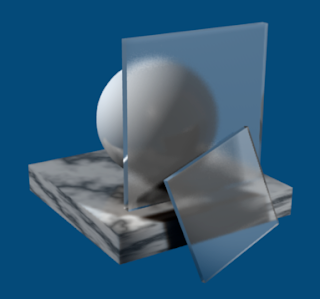
Blender's built-in rendering engine is getting pretty decent. Here's a quick test render of frosted glass.
Blender 2.5 is still under development. The main thrust of Blender 2.5 is user interface customization. If you've read my previous
Except that Blender doesn't take the analogy far enough (you can't select stuff by left-click dragging, the insertion point doesn't position itself in the spot "left" by something you've just deleted, the view doesn't scroll to frame the cursor, and so on). Most 3D programs don't have a "3D cursor" because the concept is, essentially, idiotic (until we have true 3d interfaces so that we can actually see and control cursor placement). Given that Blender does, it would be nice if the idea worked properly.
Anyway, you can customize Blender to switch the left and right mouse button behaviors (so that left-clicking selects and right-clicking sets the cursor) but this has the bad side effect of borking the camera controls (which use the middle and right mouse buttons) and wasting a perfectly good mouse button for a perfectly useless operation.

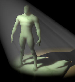
This test render shows off Blender's volumetric lighting (it's not that great, and only supports spotlights) and its sub-surface scattering (which is pretty wonderful).
Blender 2.5 plans to address some or all of this by allowing true, low level UI customization. Hopefully, when it shows up there will Maya, 3D Studio Max, or whatever "themes" that make it easier for those not up to speed with The Blender Way to get things done.
Meanwhile, Blender 2.46 RC1 managed to fix one of my gripes with earlier versions. When you create a new object it is, by default, aligned to the global coordinate system rather than the current view (which, as I pointed out, is almost never what you want). This problem has been around so long that many tutorials include steps for removing the random transform applied to each newly created object as appropriate. This is a pretty huge win for the Blender UI. Another 10-20 improvements of this magnitude and the default Blender UI might not suck so bad.