And for my next trick... let's beat Blender over the head
Blogs are kind of like Usenet where you get to avoid the flamewar. I tried posting on Blender's forums about its atrocious UI and quickly gave up since the responses were idiotic, hostile, or despairingly sympathetic. You get the picture.
Having come up with my 11 simple rules of usability, I can now beat Blender over the head in my own private (public ... but who's reading?) venue.
1. Consistency.
Blender isn't consistent with (a) itself, (b) any other major 3d app, (c) graphics apps in general, or (d) GUI apps in general. Where do I start? Guess what the keyboard shortcut for Undo is? Don't bother, it's "U". Now just imagine trying to convince the genius who came up with that one that it's a bad idea. (Obviously everyone else needs to change...)
2. Progressive Disclosure
Let's assume you want to create a new material for your model. Typically you might like to set the material to have a color and a shininess initially, and then maybe add a bitmap instead of a flat color.
Here is the icon toolbar thingy in material mode in blender:

Aside: A slightly edifying story.
A "usability expert" once told me about his "rule of three". It takes three design iterations until you can "get something right". He'd apparently confirmed this "rule" by giving students Rorschach ink blots, asking them what they thought they looked like, and telling them to modify the ink blots just enough to make their opinion obvious to anyone else looking at the inkblot, then ask ten people what they thought it was, and if they got disagreement, make changes, etc. until they got ten positives. He said most of the time, three iterations were needed.
I said I could do it first time every time. How? I'd make my changes and add a freaking caption.
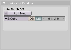
Now, having identified the correct pair of icons to click on in order to add a material, you are faced with this:

No shame if you missed this while clicking randomly on icons looking for something that might seem related to adding materials. But let's assume you figured out that this was your holy grail. Note what you're shown and not shown.
Heaving found your holy grail and clicked Add New, you'd finally get somewhat closer to the business end...

At least now this looks like it might have something to do with materials or shaders. Note the words "Preview" and "Material" and "Shader" and "Texture" being bandied about with abandon. Yup, this is it. Now -- WTF do I do?
3. Forgiveness
In Blender you can create a cube by pressing space (over a viewport, because Blender obeys someone's idea of X-Windows conventions ... yup if you're going to pick something to be consistent with, make it something hardly anyone knows, likes, or can remember), then navigating the menu that appears: Add > Mesh > Cube.
Now try to Undo that (press "U", remember? Neat huh how it's mnemonic. Pity you're wired for command-Z by thousands of hours of practice because operations you do all the time don't need to be mnemonic, they need to be efficient ... hmm I need to add that as rule 12 ... and undo, cut, copy, and paste are all next to the cntrl/apple key for a damn good reason).
Yup ... you guessed it. Even if you remember Undo, it doesn't work for some obscure things, like ... I dunno ... creating cubes. (In case you think I'm not being sarcastic, pretty much the first thing you do when modeling anything using subdiv modeling is create a cube.)
Oh, if I manually delete the cube in Edit Mode I can undo it (the deletion, not the creation).
Correction: a reader has pointed out that ctrl-z works just fine in Blender, it just isn't reflected in the menus. And since Undo doesn't work consistently (e.g. if you create a cube you can't undo it) you might be forgiven for thinking you didn't know the correct undo shortcut, look at the menu, and conclude Blender was perverse (which it is, but in a whole new way).
The same reader said the same is true for ctrl-x, ctrl-v etc. This is a stretch! Create a cube, type ctrl-x (and you get the "OK? Erase All" dialog). Now ctrl-v -- nothing. Again, in some cases Blender may behave kind of consistently, but this level of consistency is almost worse than none at all. It's like making a bike with "back pedal" drum brakes, but decorating the handlebars with lever-operated brakes that work 75% of the time.
So I really shouldn't belabor the "U" for undo thing. Instead I should point out that Blender doesn't use standard OS file requesters, say, or doesn't actually have an "Edit" menu to put the dysfunctional clipboard and undo commands in, or -- heck -- just belabor the fact that undo doesn't work consistently.

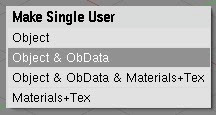
If I manually delete the cube in Object Mode and try to undo the deletion I get a dialog titled "Single User" with four options, none of which (a) make sense, or (b) appear to do anything.
4. Visibility
Go back to item 2 and look at the pictures.
Did I mention that one of the things you'll need to do is click "Add New" in textures? Then you'll need to select a different tab (go ahead, try to guess which one) to see the texture you've created...
5. Beauty ∧ Simplicity
Look at the icons. QED. This is a freaking artists' program. Every new version has a beautiful new splash screen.
6. Maximise Generality, Minimise Steps
Go back to item 2.
7. Smart Defaults
Go to items 2 and 4. Imagine that when I create a texture all the obvious features are populated by default. Consider 3D Studio Max which randomly assigns a simple texture to each newly created object (with a random color).
8. User Errors are Crashes

Under this metric, Blender crashes almost constantly. Luckily, undo sometimes does nothing. Most actions that cannot be undone (along with many that can be undone -- grrr), however, have nearly invisible confirmation dialogs that appear under the cursor and can accidentally be confirmed.
9. Avoid Preferences
Actually, Blender is less customizable than most high-end 3d programs. The most useful customization is to make the left mouse select things rather than reposition the 3d cursor (something most people will accidentally do all the time and which can be very inconvenient, can't (as far as I can tell) be done precisely, and can't be undone.
10. Wizards
Blender actually doesn't use Wizards per se. While as an exercise in Usability it represents an almost utter failure, at least it doesn't insult you with wizards that navigate the UI doing things you have no way of doing or fixing yourself.
What Blender does have is some standard scripts, with names like "UV Copy from Active" and "Object Name Editor" that sound like non-graphical wizards offering functionality that ought to be a native part of the program and placed somewhere logically rather than lumped together in the scripts folder.
11. Online Help
Blender has lots of online help and tutorials (thus virtually proving the rule -- when Usability fails, document your user interface). Given how terrible it is, Blender has quite good tutorials. You'll need them -- probably more than once.