Wednesday, April 11, 2007

The Zeroth Law of Usability


Of course by trying to keep my list short, I either left out a things (we'll get to the most important item in a sec) or left a bunch of stuff as a corollary.

0. Function As Intended

There's no point being usable if you aren't useful. This should be obvious but it needs to be said. Blender obeys the zeroth law (in spades!), and it's free and open source, making it sad that it disobeys laws 1 to 11.

Example corollaries:

Visibility (as stated) implies reduce clutter, organize things sensibly, use visual hierarchies. If I put each of these in as a law in I'd have 50 or more laws and no-one would read to the end of the list. This would make the list less usable.

A classic example of the Visibility law in action is that if you try to say delete something in a good program, the dialog's buttons will be captioned "Delete" and "Cancel" (or similar) rather than "Yes", "No", "Abort", "Retry" or "Fail". Putting the most important information in the first place someone will look is a corollary of the Visibility law.

And for my next trick... let's beat Blender over the head


Blogs are kind of like Usenet where you get to avoid the flamewar. I tried posting on Blender's forums about its atrocious UI and quickly gave up since the responses were idiotic, hostile, or despairingly sympathetic. You get the picture.

Having come up with my 11 simple rules of usability, I can now beat Blender over the head in my own private (public ... but who's reading?) venue.

1. Consistency.

Blender isn't consistent with (a) itself, (b) any other major 3d app, (c) graphics apps in general, or (d) GUI apps in general. Where do I start? Guess what the keyboard shortcut for Undo is? Don't bother, it's "U". Now just imagine trying to convince the genius who came up with that one that it's a bad idea. (Obviously everyone else needs to change...)

2. Progressive Disclosure

Let's assume you want to create a new material for your model. Typically you might like to set the material to have a color and a shininess initially, and then maybe add a bitmap instead of a flat color.

Here is the icon toolbar thingy in material mode in blender:


Aside: A slightly edifying story.

A "usability expert" once told me about his "rule of three". It takes three design iterations until you can "get something right". He'd apparently confirmed this "rule" by giving students Rorschach ink blots, asking them what they thought they looked like, and telling them to modify the ink blots just enough to make their opinion obvious to anyone else looking at the inkblot, then ask ten people what they thought it was, and if they got disagreement, make changes, etc. until they got ten positives. He said most of the time, three iterations were needed.

I said I could do it first time every time. How? I'd make my changes and add a freaking caption.

Now, having identified the correct pair of icons to click on in order to add a material, you are faced with this:


No shame if you missed this while clicking randomly on icons looking for something that might seem related to adding materials. But let's assume you figured out that this was your holy grail. Note what you're shown and not shown.

Heaving found your holy grail and clicked Add New, you'd finally get somewhat closer to the business end...


At least now this looks like it might have something to do with materials or shaders. Note the words "Preview" and "Material" and "Shader" and "Texture" being bandied about with abandon. Yup, this is it. Now -- WTF do I do?

3. Forgiveness

In Blender you can create a cube by pressing space (over a viewport, because Blender obeys someone's idea of X-Windows conventions ... yup if you're going to pick something to be consistent with, make it something hardly anyone knows, likes, or can remember), then navigating the menu that appears: Add > Mesh > Cube.

Now try to Undo that (press "U", remember? Neat huh how it's mnemonic. Pity you're wired for command-Z by thousands of hours of practice because operations you do all the time don't need to be mnemonic, they need to be efficient ... hmm I need to add that as rule 12 ... and undo, cut, copy, and paste are all next to the cntrl/apple key for a damn good reason).

Yup ... you guessed it. Even if you remember Undo, it doesn't work for some obscure things, like ... I dunno ... creating cubes. (In case you think I'm not being sarcastic, pretty much the first thing you do when modeling anything using subdiv modeling is create a cube.)

Oh, if I manually delete the cube in Edit Mode I can undo it (the deletion, not the creation).


Correction: a reader has pointed out that ctrl-z works just fine in Blender, it just isn't reflected in the menus. And since Undo doesn't work consistently (e.g. if you create a cube you can't undo it) you might be forgiven for thinking you didn't know the correct undo shortcut, look at the menu, and conclude Blender was perverse (which it is, but in a whole new way).

The same reader said the same is true for ctrl-x, ctrl-v etc. This is a stretch! Create a cube, type ctrl-x (and you get the "OK? Erase All" dialog). Now ctrl-v -- nothing. Again, in some cases Blender may behave kind of consistently, but this level of consistency is almost worse than none at all. It's like making a bike with "back pedal" drum brakes, but decorating the handlebars with lever-operated brakes that work 75% of the time.

So I really shouldn't belabor the "U" for undo thing. Instead I should point out that Blender doesn't use standard OS file requesters, say, or doesn't actually have an "Edit" menu to put the dysfunctional clipboard and undo commands in, or -- heck -- just belabor the fact that undo doesn't work consistently.


If I manually delete the cube in Object Mode and try to undo the deletion I get a dialog titled "Single User" with four options, none of which (a) make sense, or (b) appear to do anything.

4. Visibility

Go back to item 2 and look at the pictures.

Did I mention that one of the things you'll need to do is click "Add New" in textures? Then you'll need to select a different tab (go ahead, try to guess which one) to see the texture you've created...

5. Beauty ∧ Simplicity

Look at the icons. QED. This is a freaking artists' program. Every new version has a beautiful new splash screen.

6. Maximise Generality, Minimise Steps

Go back to item 2.

7. Smart Defaults

Go to items 2 and 4. Imagine that when I create a texture all the obvious features are populated by default. Consider 3D Studio Max which randomly assigns a simple texture to each newly created object (with a random color).

8. User Errors are Crashes


Under this metric, Blender crashes almost constantly. Luckily, undo sometimes does nothing. Most actions that cannot be undone (along with many that can be undone -- grrr), however, have nearly invisible confirmation dialogs that appear under the cursor and can accidentally be confirmed.

9. Avoid Preferences

Actually, Blender is less customizable than most high-end 3d programs. The most useful customization is to make the left mouse select things rather than reposition the 3d cursor (something most people will accidentally do all the time and which can be very inconvenient, can't (as far as I can tell) be done precisely, and can't be undone.

10. Wizards

Blender actually doesn't use Wizards per se. While as an exercise in Usability it represents an almost utter failure, at least it doesn't insult you with wizards that navigate the UI doing things you have no way of doing or fixing yourself.

What Blender does have is some standard scripts, with names like "UV Copy from Active" and "Object Name Editor" that sound like non-graphical wizards offering functionality that ought to be a native part of the program and placed somewhere logically rather than lumped together in the scripts folder.

11. Online Help

Blender has lots of online help and tutorials (thus virtually proving the rule -- when Usability fails, document your user interface). Given how terrible it is, Blender has quite good tutorials. You'll need them -- probably more than once.

Tuesday, April 10, 2007

Usability Could Use Some Usable Heuristics


I'd imagine that the world's worst presentations are given by the developers of presentation software. (I certainly sat through a staggeringly poor presentation by SGI folks during SGI's heyday.)

I can't find a good set of usability heuristics to beat crappy software over the head with (you must fix Blender because Tog says so), so I thought I'd write my own and pretend I'm some kind of authority.

So here, in order of decreasing importance, are my simple rules of usability.
  1. Consistency. It's the bugbear of small minds, but guess what, a lot of users have those small minds. Don't just be consistent with yourself -- be consistent with as many things as possible.

  2. Progressive Disclosure. Show the stuff they probably want/need to see and allow the rest to be disclosed if needed. Show the functionality they probably want/need to use and allow the rest to be disclosed if needed. Make the stuff you show as powerful and general as possible and you may not need to hide much at all.

  3. Forgiveness. Make it hard to screw up (try to detect and prevent errors before they're made), make it easy not to screw up (give useful feedback), and give people a way out if they screw up anyway (undo).

  4. Visibility. If you can't see it, it might as well not be there. More advanced users will look in more places, so make the stuff idiots need to see bleeding obvious.

  5. Beauty & Simplicity. Ugliness is distracting. We don't like ugly things for a reason, often "ugly" is shorthand for real problems -- disease in organisms and inconsistency and carelessness in software. A consistent program is generally a tidy program and untidiness is the easiest form of ugliness to eradicate.

  6. Maximise Generality, Minimise Steps. These (often conflicting) goals are powerful tools for rethinking and improving an interface. If you can do more with less you're almost certainly improving your UI. Improving generality (e.g. providing a dialog that does more things) is only good if it doesn't increase steps and vice versa -- that's the key. (Imagine you could easily put all the Photoshop filters into a single dialog, but it would have a menu of all the filters in it ... so you've created a very general dialog, but you haven't saved any steps.

  7. Smart Defaults. When something needs to have a default value, try to pick that default intelligently (but make it easy to change). Defaulting to the user's last choice is often a simple, effective option.

  8. User Errors are Crashes. If a user makes a mistake it's equivalent to (and often more damaging than) a crash. Treat it like one.

  9. Avoid Preferences. Configuration choices are often a design failure. Is there a way to make this not an option?

  10. Wizards. These are generally a sign of design failure. Why isn't it obvious how to do what it is the Wizard helps you do?

  11. Online Help. It ought to be good and largely unnecessary.


There you are, it goes up to 11 and Blender violates every single one. Perfect.

Please Buy Cheetah3d


Usability and 3d software, from the expensive to the free to the cheap.


Among my various half-assed skills, I can model, texture, and light 3d graphics (or "cg" as it's now referred to by the cognoscenti). I have a bunch of examples here, but I've put one up here (it was my design for QuickMP3's icon) to brighten up my blog with a picture for a change.

Anyway, I've used a lot of 3d software over the years, but I've never been a hardcore pro, and I've always thought that my stuff didn't quite cut it, especially where character modeling and animation were concerned.

Back in the heyday of multimedia development, when you needed quite a lot of skill and knowledge to get even quite modest stuff even working on most hardware and people like me could get paid -- literally -- hundreds of thousands of dollars for a couple of months' work simply because no-one else could do it that fast, that cheap, or that well, my casual interest in 3d led me to spend quite ridiculous amounts of money on 3d software.

For example, I spent something like AUD $15,000 (~USD $11,000) over a three year period on licenses and upgrades for Strata Studio Pro, ElectricImage Animation System, Form*Z, and 3D Studio Max (along with Character Studio). While these purchases were always "justified" by the work I was paid to do (hey I was earning six figures, I had no dependents, and it was tax deductible), in part, with them, the real reason I kept buying new packages instead of just making do with (say) Strata Studio Pro (relatively cheap at ~$1200) was that I kept thinking if only I had feature X I would be able to do character animation.

Anyway, I'm someone who expects to make major progress in new areas with relatively little effort, and if I don't I tend to do something else. For example, if I have some fairly major programming project that requires me to learn a new programming language, I tend to expect to get the project substantially working within a few days or pick a new language. (This is not the way to approach character animation.)

Well the good times have gone (oddly enough, roughly coincident with the dot com bust) and I don't have tens of thousands to waste on software I hardly use, so I started trying to work with very cheap or free software. (Even the upgrade prices of most of the packages I've mentioned are high, except for ElectricImage which has other issues.) In any event, all the major vendors give you free demos these days, and I must say that the free demos are not encouraging. (Hint for marketing pros at Autodesk et al: letting people have free demos won't work if you simply convince them they have no clue how to use your software.)

Here's my very quick summary of the high end 3d market. This is the stuff of religious wars ... I'm not trying to diss your favorite product.

Usability


3D Studio Max wins
Cinema4D pretty good
Maya bad
Lightwave bad and strange
XSI very bad and very strange

Functionality


Maya wins for post production, Max wins for games
Everyone else is a close second (for either)

In general, 3d programs are really complicated. I mean really, really, really complicated. This complexity is used to justify 3d programs having really bad UIs. 3d Studio Max wins because it does some really obvious stuff well:

  • You can draw stuff by clicking on a tool and then dragging in your view. The thing you want to create will appear more-or-less where you expect it to. Insofar as it behaves oddly, you can figure out how to fix it fairly easily.

  • You can move the viewport around fairly easily and intuitively.

  • You can select things by clicking on them.

  • You can modify your selection by clicking on modifier tools.

  • You can "see" most of the things you can do either by clicking tabs or right-clicking. Commands that don't apply to the current selection will generally be greyed out.

  • Undo works


In usability terms, of the high-end 3d programs, 3D Studio Max is (relatively):

  • Visible

  • Forgiving

  • Explorable


(Sadly, even today, Usability is hardly a well-established discipline -- just consider the fact that two of the best known "gurus" in Usability (who work together) have quite different priority lists (Tog's, Nielsen's) for usability.)

For what it's worth, I don't think much of Nielsen. Two of his ten items are, essentially, online help. If your users are looking for online help you've generally failed. Another item: "Dialogues should not contain information which is irrelevant or rarely needed. Every extra unit of information in a dialogue competes with the relevant units of information and diminishes their relative visibility." is absolutely right for some things and absolutely wrong for a large class of other things (you need to give the user more information when they're doing less common tasks).

The point is, the best high end commercial 3d software scores about 5/10 on the usability scale.

None of these features conflicts with the complexity of 3d programs, and yet few or none of these things are true of any of 3d Studio Max's competitors. Unless you work almost daily in most high end 3d programs you have to remember the weird characteristics of each program to use it at all (forget about efficiently).

Since none of the high end packages are terribly compelling usability-wise, there's a very capable free alternative. Blender. Blender has recently been used to complete a very impressive short film and all the files used to create the film are available for free as well -- the idea being that artists have demonstrated that they can do real high end work with Blender and are giving away the techniques they used to do it.


Now, Blender is the third least usable 3d program I've ever spent significant time trying to use (the "winner" in this category is Alias PowerAnimator, while second place goes to SoftImage XSI; I'm ignoring programs I essentially bounced off completely). If you go back to the list of virtues of 3D Studio Max:

  • If you figure out how to insert items they appear at fixed size at the position of the 3d cursor and aligned to the current view. You've probably moved the 3d cursor by accident by now so you may well not see what you've created. You almost never want to align newly created objects to arbitrary views so you'll want to learn how to strip the rotation from newly created objects...

  • It's not at all obvious how to navigate the viewport.

  • Clicking (with the left button) repositions the 3d cursor. This is not a useful feature for (I guess) 90% of users.

  • You can modify your selection in some ways by entering edit mode (press tab) and in other ways by leaving it (press tab). Anything that works in both modes behaves differently in the two modes.

  • The good news is that many commands are visible if you have the correct tab selected. The bad news is that there are two levels of tabs, the icons make no sense, and many functions are labelled using hardcore industry insider jargon (e.g. catmull-clarke).

  • Undo only works sometimes.


Hey, but it's free.

Now I did render the forklift icon (above) using Blender. But I didn't model it in Blender, and I had to pretty much look up documentation every step of the way. And I doubt I could do it again without going through the documentation again.

Really, the only reason I've persevered with Blender is that it's free. In actual fact, it's probably the most unusable 3d program I've ever used, but XSI is a dog and it's Windows only and PowerAnimator has been replaced by the far more usable Maya (well, the far more Usable Maya 8.5; Maya 1-3 were horrible too), which I would probably buy if I could justify the expense. Also, Maya is a dog and has draconian licensing. (Blender works very nicely even on low end hardware. It's also tiny. And did I mention it's free? So it's on every computer I ever touch.)

Despite being Open Source, any attempts or requests to improve Blender's UI are met with outright hostility by the community. The users are invested in the lousy UI which they know and claim to love. The programmers are ... well programmers. Either the UI makes sense to them or it doesn't impinge on their consciousness when test rendering glass balls in HDRI environments assembled with two clicks or loaded from a file made two years ago. The best we can hope for is that the next version will have an absolutely terribly but completely user-customizable interface. This means that once you've figured out how to do something and provided you can be bothered you can fix each UI problem for yourself as you discover it and then try to remember what you did.

Usability Rule # ... I don't know ... 7: big preference dialogs are not a substitute for decent UI design. (Why? Well for one thing, an importent way to learn to use stuff is to ask people, and people won't know the answer if everyone is using a differently configured program. Basically every configurable option conflicts with Usability Rule #1: Consistency. This doesn't mean that every configurable option is bad, but it does mean it comes with a cost, and the benefit had better be worth it.)

So, enter Cheetah3d. At $129 Cheetah3d 4.0 is, in my opinion, for anyone except full-time hardcore 3d artists, the best 3d program on the planet. Now, please note, I haven't used them all, and I've used even fewer of them lately. But, based on my pretty well educated guesses, none of the other software out there has a fighting chance.

It isn't the best dedicated modeler around (that would be modo or if you don't want to spend the money perhaps silo) and it isn't the best renderer around. It doesn't have every feature you might want (it conspicuously lacks particles, volumetric lights and materials, and motion blur). So what's so good about it?

  • What it does, it does very very well.

  • It does almost everything you need

  • It has a clean, uncluttered UI

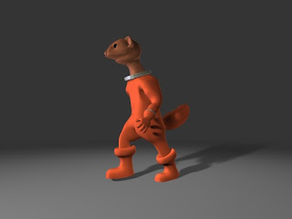
  • It's fast and light and cheap enough to be on every computer you use*

  • Even I can do character animation with it

  • It's fully scriptable (via JavaScript but, unfortunately, not AppleScript

  • Its native file format is human-readable XML

  • It has a seamless workflow to Unity 3d


Oh, and it only runs on a Mac.


* As long as it's a Mac.