Thursday, May 08, 2008

I've Moved!


I've moved everything from this blog (including comments) to my own website mainly because I (a) want to "own" the stuff on it, some of which (I think) doesn't suck, and (b) I vastly prefer WordPress's UI. (And yes, I've got caching support so if one of my posts is ever popular there is a small chance it won't fall over.)

Thursday, May 01, 2008

But Will They Get Out To Vote?


Political commentary hidden inside GTA IV. It's crude, overlong, and only funny in parts.

Lenovo: We Don't Get It


So here's an ad for the Lenovo X300. I'll wait here patiently while you watch it.

"No compromises." Except for industrial design, screen, keyboard, and operating system. It does have features you always need on an airplane -- like multiple USB ports and an optical drive. Oh wait, I use at most one USB device on my laptop except for at home (where I run it lid down with a Mac keyboard, which works as a USB hub because Apple isn't retarded). And I avoid even putting CDs or DVDs in a laptop in transit to save battery power.

I don't own an Air, and probably never will, but I understand exactly why some people would want one, oh and yeah, it's still the top selling piece of hardware at apple.com/store (ahead of entire categories of other Macs).

The Travellers


I loved this comic way back when. Sadly it's dated rather badly (too many references to movies we've happily forgotten, such as "Life Force"). I'm glad to see someone it's still around.

It's The Old Open Technology Trick, Chief


The Open Screen Project is supported by technology leaders, including Adobe, ARM, Chunghwa Telecom, Cisco, Intel, LG Electronics Inc., Marvell, Motorola, Nokia, NTT DoCoMo, Qualcomm, Samsung Electronics Co., Sony Ericsson, Toshiba and Verizon Wireless, and leading content providers, including BBC, MTV Networks, and NBC Universal, who want to deliver rich Web and video experiences, live and on-demand across a variety of devices.

From mx:EverythingFlex


So, a bunch of the Usual Suspects have decided to partner up with Adobe in an attempt to (depending on how you look at it) keep Flash/SWF/FLV dominant in the web video market or help make Flash/SWF/FLV relevant again in the web video market.

We're Number One!


If you look at what format most of the video on the web is in, it's WMV (or ASX or AVI or whatever -- Microsoft's video container format du jour). This is because most of the folks online use Windows and have no clue how to encode it so that other people can watch it conveniently.

If you look at the video format that most people on the web watch, it's FLV (Adobe's video container format, which is Flash's video container format). FLV is used for YouTube, Hulu, and abc.com. It's very popular because, frankly, Flash provides the best options for providing custom web players and is solidly cross-platform (if it plays on a Mac it plays on Windows and vice versa).

If you look at the video format people actually pay to watch, it's QuickTime (i.e. MOV, Apple's video container format). Aside from that fact that Apple is selling a buttload of QuickTime, while other folks are merely giving away stuff, there's a nice little twist in this.

QuickTime is not only the oldest digital video container format, it's also by far the most flexible, general-purpose, and well-engineered. Unlike the others it was designed from day one as capture, edit, and delivery format, and to handle arbitrary numbers and kinds of media tracks. A QuickTime MOV can contain multiple video tracks (e.g. for different bandwidths or resolutions), audio tracks (e.g. languages, directors' commentaries), text tracks (e.g. subtitles or index markup), interactive tracks (e.g. custom interfaces), and -- well -- anything else you can think of. And it's been this way since day one.

Recognizing this, after developing two complete generations of delivery-only video formats (MPEG, and MPEG2/3) that weren't flexible and didn't even include proper time-synchronization, the Motion Picture Expert Group went to Apple and asked to license QuickTime. The MPEG4 video container is, in fact, QuickTime. So H264 videos (which constitute a large number of WMV and FLV videos) are in fact QuickTime videos in disguise. Another consequence of this is that the QuickTime container format is, effectively, open and has been since Apple essentially handed it over to the MPEG folks.

Now, what does this announcement by Adobe mean? Well, the Usual Suspects are essentially a bunch of companies who'll sign onto any bandwagon that sells more hardware and chews more bandwidth (Cisco, Intel), technical incompetents (such as the BBC, who, despite being a public broadcaster, have managed to pick one non-cross-platform proprietary content delivery technology after another, and had to be dragged kicking and screaming to make their iPlayer work on Macs or in FireFox) and the "we hate Apple" club (NBC Universal who will cheerfully burn millions of dollars to spite iTunes). So we can guess what their motives are.

Thanks Goodness It's "Open"


First of all, you need to realize that FLV was the only "closed" container format. You can already write custom codecs for QuickTime and Windows Media, and their container formats are already public. This is why QuickTime can play WMVs compressed with supported codecs and vice versa. This is also why you can't open up an FLV in QuickTime, even if it's compressed with a codec QuickTime supports. So Adobe is actually playing catchup here.

As for the "benefits" to the consumer of FLV being open... Well, when Apple controlled QuickTime every QuickTime video would play on any machine with QuickTime installed. But lots of MPEG4 videos won't play in QuickTime (despite being, essentially, MOVs) because the open nature of MPEG4 allows folks to write their own codecs. (QuickTime already allows for third-party codecs, but most QuickTime developers seem to write cross-platform codecs.) So, in essence, Adobe is opening up FLV to be just as lousy an end-user experience as every other more open format (QuickTime and WMV have been "open" in the sense that FLV is being opened since day one).

Of course, FLV is already a lousy end-user experience for anyone not using a computer. Flash on the Wii won't play many (perhaps most) FLVs because one of the first things to go when Adobe/Macromedia streamlines Flash is codec support. (The same is true for QuickTime on the iPhone.)

So, in the end, what does the announcement mean? Well, I guess Adobe would prefer manufacturers to settle on their newly "open" FLV container instead of the already open MPEG4/QuickTime container, or the already pretty much open WMV container. Big surprise. A bunch of manufacturers have signed on, but whether they'll ship Flash-only devices or Flash-too devices isn't clear. If you put H264 hardware in your device, will you deliberately spite H264 that isn't wrapped in an FLV container? I doubt it: not even Adobe does that (you can pass QuickTime movies with H264 encoding to SWFs as if they were FLVs and they just work).

Of course, if Adobe is actually going to publish the FLV format, Apple and Microsoft can start transparently playing FLVs with supported codecs, eliminating the need for Flash to play back H264 FLVs. It also makes implementation of <video>foo.flv</video> in HTML5 easier (again, without necessarily requiring Flash). So, on the whole, I don't see how this is much of a win for Adobe or the general public in the short term, and it seems like it will probably hurt Adobe in the long term.

Wednesday, April 30, 2008

The Design of Everyday Things


"The Macintosh is the first computer interface worth criticizing." Alan Kay*


Today, Apple has made usability all but a household world, and you probably don't need to fight major battles in software development projects to have some kind of iterative usability testing budgeted into a project. This hasn't been the case for very long.

Shortly before the dot com bubble burst, I remember an article about the design of e-commerce sites in which a number of test subjects were sent to a large number of major e-commerce sites with instructions to buy a specific item sold on each one. I don't have the article or exact figures to hand, but as I recall, in 70% of cases the users could not figure out how to complete the transaction.

It's relatively easy to fix usability problems in software. As a software guy, it's pretty horrifying to bump into the world of atoms (versus bits, to use Nicholas Negroponte's excellent dichotomy) and discover that the whole usability idea hasn't sunk in too deep.

I've worked in usability on and off (mostly off) for nearly twenty years. I remember trying to get managers and partners at Andersen Consulting to read the Apple Human Interface guidelines, just to see that this kind of thing could actually be codified in a useful way. In 1995, more than ten years after the Mac was released, arguing for usability testing and design standards was still pretty radical in the world of IT.

Not many books can actually change one's life in a real way, but I think The Design of Everyday Things by Don Norman** is one such book. Read this book and it will quite likely change the way you think about everything. Even though I thought I was pretty savvy about UI design, it changed the way I saw the world.

The reason I bring up this whole topic is that I've been brought head-on into the world of bad design by my twin girls. Baby stuff, stuck in the world of atoms, is oh, so 1983. You may have read my rant about breast pumps, so I won't revisit that topic right now, but here are a few examples of staggeringly bad design I've been living with for the last five weeks:

  • Baby Sleepers (pyjamas for those who haven't had babies) often have single zippers running from the baby's neck down to the tip of her left foot, meaning you need to completely unzip the whole thing just to check or change a diaper.

  • Disposable diapers are designed in such a way that it's almost impossible to tell which way up or around they are in a dimly lit room (like the one you'll be changing them in at two in the morning). They're also folded with the tabs where the baby's behind will be, so that you need to stick your finger between the diaper and the baby's bottom to tease them out (in the dark at 3am). Why not fold them the other way?

  • Our baby bath (the highest rated we could find) is designed with a little hammock suspended over a small tub. Using the provided scoop to get water from the reservoir to the baby involves threading a narrow gap each time. Simply altering the shape of the tub (which would cost nothing had they thought of it) would eliminate this constant annoyance.

  • Our tandem stroller (also well-rated) is designed to accommodate our car seats (good idea) but switching it into accept car seat mode requires remembering which bits need to be pushed back or released, and they snap back out of position at the slightest provocation (so you can't just leave the stroller in its more useful mode). And, here's the kicker, the stroller has a basket for carrying stuff beneath the babies, but putting it into car seat mode makes it completely impossible to get anything in or out of the basket. Did even ONE person test this device before starting production?

  • A mixed case is our baby swing. Its safety harness is admirably well-designed for quick release (a good feature since the last thing you want is to have to fiddle around a baby you've just lulled to sleep) but fastening the harness is a little like learning a magic trick.

  • There's a remarkable lack of color coding options for things like baby bottles. This is very annoying if you have twins and need to prep a bunch of stuff in advance specifically for each twin such that you can figure out which bottle is for which baby at 3am.

  • Whoever designed the labels for marking up breast milk sachets didn't think to simply mark days of the week etc. on the sachets so all you'd have to do would be to tick a box. I know writing out a date on a plastic bag is something I love to do ten times a day while dead tired. And boy, reading that writing is going to be easy, I bet.

  • And finally, our bottle warmer (again highly rated) is designed so badly that Don Norman might have lavished his most sarcastic accolade on it: "it probably won an award". Or to borrow a phrase from Roy and H.G., "it's a sad joke". The principle is this: it has an element and some measuring cylinders. You place the baby's bottle above the element (in a socket) and pour in a measured amount of water, then press a button. The element boils the water and then shuts off when the water is gone (I assume the element gets too hot and that triggers the off switch).

  • So to warm a bottle (remember, you're doing this while dead tired, in the dark, and it's three in the morning) you need to measure out a certain amount of water into this stupid tube, pour it in, and then warm the bottle. Here's the kicker though: a good deal of heat comes off the element after it switches off, so the bottle temperature is highly variable based on how long you wait after this piece of junk switches itself off. If you're heating two bottles for some reason, the second will always get more heat than the first. And that's assuming you measured the water into the damn cylinders correctly.

  • This design is only slightly better than the infamous coffee pot (with the spout pointing over the handle) that graces the cover of The Design of Everyday Things ... but of course the coffee pot is an intentional joke. This thing is a product that people not only buy and use, but recommend. Go figure.


It's not just that this stuff is thoughtlessly designed (I won't say it's designed by morons or incompetents, it's more likely it's not designed at all, or without any kind of user testing), it's that customers aren't complaining blue murder about it. It's like the people who argued that DOS was easier to use than a Macintosh and then went back to editing AUTOEXEC.BAT to try and squeeze out another 2K of RAM so that their program would run -- the user-base is too accepting of garbage for vendors to feel pressure to improve their lousy products. Just like in 1983 with software.

* I've seen this quotation in various forms in a lot of places, but don't have a definitive source, so it's certainly paraphrased and may well be apocryphal.

** This book rates only two stars on Amazon.com while quite mediocre novels often score better. One legitimate criticism of the book is that it really doesn't offer any recipes for good design, merely ways of criticizing failed design and (less often) appreciating good design. It's quite clear based on twenty odd years of no-one else managing to provide such recipes (beyond a few useful lists of heuristics) that this is really hard, if not impossible. In any event, I think this book is utterly brilliant, but it won't tell you how to be a great designer.

Monday, April 28, 2008

Interstellar Navigation by Dead Reckoning


Aside: so much for YouTube. Lousy job of encoding and it lost my soundtrack. So I rustled up some quick code and voila.


My favorite science fiction writer wrote a novel in 1967, give or take, called The Killing Machine in which the hero is attempting to locate a planet without precise coordinates, but has the assistance of a native of that planet who can remember the constellations of the night sky. The hero gets to what he believes is the correct "region" of space and asks her to look for a familiar constellation, because that will be direction to the star system in question.

This may seem far-fetched, but it's actually extremely practical (insofar as anything involving interstellar travel is practical).

I've never really looked into the technique in detail, but there's some discussion right now of a clue that the obsessive fans of Battlestar Galactica (the new series of course) who have noticed in the latest episode The Ties That Bind the constellation Orion showing up in several space shots. This would indicate that they must be getting close to Earth...

Now some folks have dismissed this, saying that it's bad science and they'd need to be incredibly close to Earth to recognize any constellations. These folks are just dead wrong. The two brightest stars in Orion are Betelgeuse and Rigel which are extremely bright and distant stars. The belt, similarly, is composed of distant stars. Orion would be easy to recognise from a considerable distance -- if you were looking straight towards Sol.

The video I've attached demonstrates all this using the wonderful free program Celestia. The upshot: Orion is easily recognizable from over one hundred light years out from Sol (assuming you're on the far side of Sol from Orion) and every other constellation is distorted beyond recognition.

Sunday, April 27, 2008

Breast Pumps are a Racket


My wife is using a Medela breast pump in her ongoing efforts to avoid raising our twins on formula. We actually bought a Medela breast pump before the twins were born, but the hospital gave us an even more up-market one as a "gift" so we ended up returning the one we bought.

First of all let me say this. Breast pumps are a racket. You can buy a pretty robust device for pumping up car tires that runs on 12v for $20 and it's probably better constructed than a typical breast pump. I'm sure there are lots of considerations that drive up the cost of a breast pump compared with a dirt cheap tire pump, but come on: The Medela breast pump we bought retails for ~$300 and is approximately as well constructed as a decent quality toy. OK it's made of non-toxic plastic, and it presumably is designed not to rip a woman's nipples off by accident, but seriously.

Our breast pump has a "valve" designed to allow milk to come into the collection bottle but prevent air from leaving the bottle when the pump "sucks". This "valve" is a piece of flexible plastic the size of a dime weighing a fraction of a gram, and it costs $5 for two of them. (So far we've lost three down the drain.) This is a freaking scandal.

It's not like breast pumps are so uncommon that economies of scale don't exist. Our hospital is giving a breast pump to every other woman who gives birth (it's that or a stroller; if you do the math, you take the breast pump). Everyone gets born. The average woman gives birth two and half times. What. The. Frack.

Now, get this: the best approximation for the shape of a woman's breast that the genius designers at Medela can come up with is a cone. They sell big cones and small cones. Ameda (actually produced by the company formed by the guy who invented the electric breast pump) offers a silicone widget that's designed to simulate a baby's mouth. But apparently Ameda hasn't figured out that by selling their breast pumps for less, people assume they're not as good. (I can't find any review sites that indicate Medela are as well-liked by their users as Ameda, despite the "Stockholm Syndrome" that anyone who buys a more expensive product tends to suffer from -- yes Apple we're talking about you.) Any site I've found which shows reviews of both Ameda and Medela products, the Ameda products (which are cheaper) get better reviews.

Again, Ameda have done a bunch of really decent stupid things such as (a) making their gear completely compatible with third party bottles, (b) making their simulated baby mouth widgets compatible with third party breast pumps, and (c) providing excellent customer service (according to numerous reviews I've read). What they obviously should have done is sell tiny plastic flaps for $2.50 (Ameda's valves are larger and won't wash down sinks) and force users of their pumps to buy their expensive nipples and collars and single-use-leaky-plastic milk storage bags which would make their products more profitable and allow them to hire reps to convince hospitals to use their products in more hospitals, and be able to give away their laughably overpriced pumps to new moms.

We've probably spent about $100 buying plastic doodads compatible with our "free" breast pump so far, but after losing a day's worth of milk to their lousy (and expensive) storage bags, and discovering today that (unlike Ameda) we need to sterilize the plastic tubes (joining the pump to the collection gizmo) of our Medela system if moisture gets in (Ameda's pumps are completely isolated from the collection system by means of a local cylinder) we're on the verge of setting aside the entire system and switching to Ameda.

In the end, as I said to my wife, it comes down to this. If you have to use a machine to suck on your breasts, would you prefer one designed by Swedes or Germans?

Thursday, April 24, 2008

Wannabe Photoshop Killers, Revisited


Photoshop Elements 6 for the Mac has shipped which means bad times for half-assed shareware products pretending to be cheap Photoshop replacements. It's not that Elements is itself a Photoshop replacement, it's just that it's more of one than the half-assed wannabes.

If you've been keeping score, the candidates are Pixelmator, Acorn, Iris, and Photoline. I've tried them all and the short version of my opinion is that Pixelmator is a pretty but ultimately useless piece of junk, Iris is an ugly, useless piece of junk, Acorn is a tidy, scriptable little app that works well but will almost certainly be missing some feature you need, and that Photoline is actually a credible replacement for Photoshop in a pinch, although it's a bit ugly.

Where does Photoshop Elements 6 come in? Well, it's actually cheaper (at least in the US at the current exchange rate) than Photoline, and not much more expensive than the others ($89). For digital photographers it's simply vastly more useful than these other programs, since it has ACR (Adobe Camera Raw) which is a professional quality RAW converter. Enough said. For anyone else it has several killer features that only Photoline can match:


  • Selection Tools that work (actually, Acorn's don't suck)

  • Text layers that work

  • Curves


I can't stress enough how it fundamentally doesn't matter what else a graphics program does, if you can't select what you want, everything else is a waste of time. This is like trying to ship a word-processor with broken text selection*.

Eye Candy


Pixelmator and Acorn both have incredibly nice front ends for CoreImage. Just how much faster and more interactive these are than Photoshop's filters is just breathtaking -- I might be tempted to switch to Pixelmator just to use its zoom blur filter on the rare occasions I use zoom blur -- but the sad thing is that Photoshop's are good enough (as are Photoline's) and unless you have no taste, filters are NOT the thing you spend most, or even a significant fraction, of your time in with an image editing application.

And because the guys who've written these applications are fundamentally just leveraging Apple's toolbox routines, the set of filters you have is dictated by what Apple gives you for free, rather than what artists actually needs. E.g. fractal clouds and noise are two of Photoshop's most useful filters, but there are no fractal clouds or noise filters in CoreImage so tough luck. (Photoline has a general purpose fractal generator with presets which is better in some ways than Photoshop's noise and clouds filters, but worse in others.)

Useful in a Pinch


One of the really nice things about good freeware and shareware is availability in a pinch. If I find myself needing to edit an image on some random computer, I can download Photoline, using the license stored in my gmail account, perform my edit, and then uninstall in a matter of minutes. Most shareware apps aren't so large that downloading them is painful (Photoline for the Mac is ~20MB) while Photoshop Elements is a 1.25 GB download and involves product activation.

Conclusion


Before Photoshop Elements came out only two of the wannabe apps could even begin to justify their existence. Acorn is scriptable, making it intrinsically useful for workflow automation in a way that Pixelmator and Iris can never be. Iris is simply a joke, while Pixelmator could be useful one day. Photoline is a useful Photoshop replacement in a pinch, and its capabilities complement Photoshop Elements' capabilities since Photoshop Elements has features photographers will want, while Photoline fills the gaps if you don't want or can't afford Photoshop CS3.

* Well, Microsoft does that and seems to make money. You cannot select parts of two different words in Microsoft Word. E.g. if you accidentally typed "teh rpoblem with Word" you can't select the hilited text to fix it. Once a selection extends beyond one word, Word forces you to select entire words, leading to endless annoyance.

Thursday, April 17, 2008

Brief Adventures in 3G


During my recent hospital visit I found myself desperately in need of internet connectivity. The hospital provided wireless internet in the main "food court" area, which was a significant hike (the hospital covers multiple city blocks joined by 2nd to 6th floor crosswalks) from my wife's bedside, so I settled for daily email checks along with my morning coffee.

But if hospital is one thing, it's boring, and my craving for internet connectivity eventually got the better of me.

My wife and I have been planning to get 2nd Generation iPhones as soon as our Verizon account expires and assuming Apple releases a second generation iPhone we like (preferably with 3G networking and SDHC support or a lot more internal storage) but in the meantime, what to do?

It turns out that Verizon offers several wireless broadband solutions via their 3G network. The options are: PC card modem, USB modem, or 3G cellphone. Since I didn't want to buy a modem or get locked into a plan, I decided to try the 3G cellphone option.

Now, I've used the iPhone to browse the web via its EDGE network both in stores (after getting an Apple person to show me how to turn off WiFi) and using friends' iPhones in random places, notably in the stadium with 110,000 people at a Crimson Tide home game (where I would say that EDGE was uselessly slow).

Well, I've tried Verizon 3G both through my Motorola RAZR v3 (c? m?) with varying levels of reception (we get full bars in our house) and the best results I could squeeze out of this "3G" "wireless broadband" network was roughly comparable to what we got out of EDGE at anything other than a Crimson Tide game. That is, for about two minutes, I was able to slowly view simple web pages. Aside from that, whether using my cellphone as a modem via USB or Bluetooth, or browsing directly on the phone, I got unbearably slow throughput. At the end of all my browsing attempts, the running totals on the bandwidth meter were all still zeroes.

They tell you "5GB is effectively unlimited". I was concerned by the 5GB limit (since they charge you a ridiculous $0.50/MB over the limit) but I don't think even a dedicated masochist with a point to prove could bear to suck 5GB per month down this particular straw even if it were theoretically possible. From my experience having managed to upload and download a total of less than 512kB (I'm assuming more would have rounded to something beyond "0") I'd need to completely restart my connection and my phone (the latter a painfully slow process fraught with reminders that I'm a Verizon customer who will not be extending my service plan) about ten times per MB downloaded, which means to download 5GB I'd need to restart my phone 50,000 times. By back of envelope that's about ten solid days of watching my phone's shutdown and startup animations.

(I should add that separate tests at home where we get "more bars" produced scarcely better results.)

I'm sure that, in theory, 3G is pretty wonderful. In practice, however, the speed of Verizon's 3G network in downtown Birmingham is atrocious (or is it the Motorola v3 (c? m?)), and it would be faster to walk to a WiFi hotspot to download a few web pages. Assuming you have WiFi support, which the iPhone does and most of its rivals do not.

Oh and when I cancelled the 3G data "feature" on my phone account, Verizon charged me pro-rata for the fraction of a month I kept it, even though I stopped using it after the second day and clearly got nothing out of it. Thanks Verizon.

Monday, April 14, 2008

Favorite Music Videos


While I'm reminiscing about music, here are some of my favorite video clips from the days when MTV actually showed music videos and some talent and thought went into rock videos.

Subterranean Homesick Blues, Bob Dylan
Blind, Talking Heads* -- YouTube does not do this justice; the projected face effect is absolutely brilliant, and the drooling tool is a bit of statement, eh?
Love for Sale, Talking Heads* -- sadly all the YouTube copies manage to cut off the final shot of one of the many kissing couples pulling apart and her lip sticking, rather grossly, to his, which is simply priceless.
And also Once in a Lifetime and This Must Be The Place, Talking Heads
Whip It, Devo
Orinoco Flow, Enya
Don't Let's Start, They Might Be Giants -- mind-bending clip made for no money at all
Sat in Your Lap, Kate Bush -- bonus points for weirdness?
Boy in the Bubble, Paul Simon -- amazing to consider this was made in 1987
Missionary Man, Eurythmics -- Like David Byrne and women on horseback, Annie Lennox is a special effect (link is to Thorn in My Side video which isn't that great a video, but Annie Lennox looks like she's CGI in it, and it is my favorite Eurythmics song)
Don't Dream It's Over, Crowded House
Say Goodbye, Hunters and Collectors
Bohemian Rhapsody, Queen -- in Australia, most fondly remembered as "the song that finally kicked Fernando out of the No. 1 slot"
Ashes to Ashes, David Bowie
Love Shack, The B-52s
Oh Superman, Laurie Anderson
Sledgehammer, Peter Gabriel -- tour de force of stop motion

More Recent Videos that give me hope


Perhaps these are the good old days of music videos too. Certainly, there are a few musicians around who seem to really think about their video clips (or hire someone who does) and of course the technology has progressed astonishingly.

Bachelorette, Bjork
Isobel, Bjork
All is Full of Love, Bjork
In This World, Moby
Why Does My Heart Feel So Bad, Moby
Right Here, Right Now, Fat Boy Slim -- simple idea, brilliantly executed. For some reason I love this track too, even though it's repetitive as hell
Weapon of Choice, Fatboy Slim

Better Idea than Execution


Only for Sheep, Le Bureau
Fade to Grey, Visage (actually a lot lamer than I remember)

* Talking Heads (or perhaps David Byrne) probably deserves a category all by themselves, having produced more awesome videos than the rest of the industry put together.

Favorite Cover Versions


I just thought I'd share some of my favorite ever cover versions of songs. A good cover brings something to a song that makes it seem completely new, and doesn't make you wish you were listening to a different version. In other words, it's not like almost every performance on American Idol.

Bizarre Love Triangle, Frente
Don't Fence Me In, David Byrne
Quinn the Eskimo, Manfred Mann
Always on my Mind, Pet Shop Boys
Times They Are A-Changin', Simon & Garfunkel
Star Spangled Banner, Jimi Hendrix
Sometimes when I'm dreaming, Art Garfunkel (strangely hard to get, apparently it was released on a "Greatest Hits" album in the UK and Australia, but not in the US or Canada)
America, David Bowie with omnichord (part of a 9/11 Benefit Concert, no idea how to get it except by ripping the DVD)

I can't even come up with ten.

My current canonical example of a redundant cover version is The Bangles version of Hazy Shade of Winter, i.e. a derivative and clearly inferior version of the original. Or pretty much any performance on American Idol. But even some famous and successful covers, such as Jeff Buckley's Hallelujah are redundant and unoriginal (his is not really much different from John Cale's rendition, which itself wasn't much different from the original).

Singing Babies to Sleep


Well I sang it once, I sang it twice,
I'm gonna sing it three times more,
gonna stay 'til your resistance is overcome.
'Cause if I can't sing my boy to sleep,
well it makes your famous daddy
look so dumb.
Hmm, he looks so dumb.

From St. Judy's Comet, Paul Simon


Leonard Cohen, 1969 (from Wikipedia)


One song I always knew I would sing to my children, if I ever had any, was St. Judy's Comet by Paul Simon. Not many songwriters seem to have set out to write lullabies, and it's great that my favorite songwriter of all time did. Of course he wrote the song for his first son, Harper, so I'll have to change "boy" to "girl" in a few spots, and of course I'm not famous so I guess it's "your lazy daddy look so dumb" or something. When the girls are older I can prompt them for suggestions...

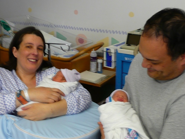
I don't know many lullabies, and the ones I do know are pretty lame, strange, or vaguely threatening. I have, however, had the extremely satisfying experience of singing my babies to sleep, and it occurred to me that this would be a great opportunity to memorize the lyrics of some new songs.

I don't know how most people memorize lyrics, but I learned songs in three ways. The first was being required to perform them for some kind of stage production. I can still remember snatches of the Mikaido because we did some kind of "good bits" version of it in primary school.

The next was sing-alongs, which were a class activity from grades 1 to 6 when I was a child. We'd all gather around the radio at a specified time each week with books of songs (which we had to bring $2 to school to pay for at the beginning of the year) and learn new songs and repeat songs we'd learned earlier. I can remember quite a few songs (some of them hauntingly beautiful) from those days, including "Donna Donna Donna" a lament for a calf being taken to market for slaughter, and a song about Norfolk Whalers. Odd that both songs involve cruelty to animals. Anyhoo...

But most of the songs I have learned come from the period from the age of ten or so to the end of college during which I was (a) sufficiently poor that each LP or CD was a major investment and thus was listened to incessantly for days or weeks after purchase, (b) obsessed by popular music, and (c) had time to spend hours listening to albums while reading the lyrics from the back of LP album covers or liner notes or (at the very end) from the little booklets which accompanied some CDs or, in the case of bands like REM, trying to puzzle out rather poorly enunciated lyrics with no help at all. (I remain convinced that in Bohemian Rhapsody, "Beelzebub rides a devil's motorcycle".)

So I have a little songbook in my head that contains the complete lyrics of many songs by Paul Simon, the Beatles, Tom Lehrer, a few by the Eurythmics, Suzanne Vega, Talking Heads, They Might Be Giants, and so on, and then I can kind of kind of manage half a verse here and there of the rest.

While looking around for possible lullabies the second songwriter I thought of after Paul Simon was Leonard Cohen. I'm a latecomer to Leonard Cohen. I bought So Long Marianne a long time ago because a lot of people (both friends and musicians in interviews) I liked and respected liked and respected Leonard Cohen*. I found the album pretty impossible to listen to. (The title song was lovely, but I hated Cohen's nasal, whiny voice. A pretty common reaction, I think.)

* It's fairly well-known that working musicians have far broader tastes than their audiences, and thus listening to the stuff the musicians you like listen to is likely to broaden your tastes in odd directions.

Anyway, my sister spent some time living in the US in the early 90s and came back with I'm Your Man, which immediately hooked me. (It didn't hurt that I'd heard "Everybody Knows" in the flawed but still watchable Christian Slater movie Pump Up The Volume a few years earlier. I'd liked the song so much I bought the soundtrack album, which is pretty darn good but has Concrete Blonde covering the song versus the original version, which is in the movie.

When Cohen released I'm Your Man he had perfected a new sound that he'd started experimenting with an album or two earlier. Instead of a whiny, nasal voice accompanied sparingly by folk instruments and female backing vocalists he switched to a deep crackly bass voice accompanied by a big, textured, synthesizer sound and (of course) female backing vocalists. The result for some reason brings to my mind the image of honey dripping over coal. This made Cohen a lot more accessible to latecomers such as myself, and eventually I grew to love even his whiny, nasal performances because of his arrangements and phrasing.

I mention all this because I am meticulous -- borderline obsessive -- about remembering where I picked up my predilections from. I think it's very interesting to know how you grow to like something, and when, and why. E.g. I still remember who first suggested I read a novel by Ursula Le Guin, and what it as. Or when I first read a "real" Science Fiction novel. Or that I didn't much care for Blade Runner the first time I saw it, although some snatches of dialogue were brilliant, and haunted me.

A huge proportion of Cohen's output can do service as lullabies. I think this is because his songs are fairly simple melodies, sedately paced, usually without a bridge (why anyone would put a bridge in a lullaby escapes me), often without a distinct chorus, and are manageable by a singer with a modest vocal range. Oh and the songs are also downbeat and have a lot of verses. Best of all, they're really good songs with marvelous, evocative lyrics, and what Cohen lacks in terms of what Paula Abdul might call "the colors of his voice" he makes up for in phrasing. (Phrasing is, apparently, something that, along with enunciation, is not learned until after you graduate from American Idol.)

While I'm on this sidetrack, it astonishes me that, on American Idol, anyone picks songs by Queen. The trick, it seems to me, is to pick very good songs best known for performances by mediocre singers, versus mediocre songs best known for performances by very good singers. Even "mediocre" pop singers are generally better at phrasing than the contestants on American Idol, but at least you won't be forcing the audience to compare your vocal range to Freddy Mercury's. So, Queen: no, The Police: yes. But I digress. Again.

There are two obvious objections to using Cohen's songs as lullabies. The first is that the songs invariably feature "adult concepts". I can happily dismiss this objection because his words are never explicit, so any child who can figure out the adult concepts is probably sophisticated enough to deal with them. In any event, traditional lullabies often feature far worse expressed far more clearly ("Rock-a-bye baby" for example). The second is that his songs often feature religious themes and references -- Hallelujah (which has a chorus, also making it less lullaby-worthy) is utterly drenched in the Old Testament. Again, I can dismiss this because, hey, this is Western Society, and it's better to have your Judeo-Christian references out in the open, and if you're going to have them, let's take a look at the tough parts of the Bible (in "Song of Isaac" Cohen tells the story of Abraham from the point of view of the son being sacrificed). If more religious people approached religion the way Cohen does, I might not be so hostile to religion.

Anyway, here's my favorite adopted lullaby so far:


I loved you in the morning, our kisses deep and warm,
your hair upon the pillow, like a sleepy golden storm,
yes, many loved before us, I know that we are not new,
in city and in forest they smiled like me and you,
but now it's come to distances and both of us must try,
your eyes are soft with sorrow,
Hey, that's no way to say goodbye.

I'm not looking for another as I wander in my time,
walk me to the corner, our steps will always rhyme
you know my love goes with you as your love stays with me,
it's just the way it changes, like the shoreline and the sea,
but let's not talk of love or chains and things we can't untie,
your eyes are soft with sorrow,
Hey, that's no way to say goodbye.

I loved you in the morning, our kisses deep and warm,
your hair upon the pillow like a sleepy golden storm,
yes many loved before us, I know that we are not new,
in city and in forest they smiled like me and you,
but let's not talk of love or chains and things we can't untie,
your eyes are soft with sorrow,
Hey, that's no way to say goodbye.

Hey, That's No Way To Say Goodbye, Leonard Cohen


If you haven't heard this song, I urge you to listen to it. Cohen's phrasing is immaculate, managing to make a very slow song sound breathless and stream-of-consciousness. What's doubly amazing is that while Cohen did this during his whiny, nasal phase, and there are over ten cover versions of it on the iTunes Music Store in the US, only Roberta Flack has managed to produce a version other than Cohen's versions that isn't incompetent or simply a poor copy of Cohen.

Final Note


A third objection to Cohen as a lullaby-writer, especially for lullabies to be sung to baby girls, is his apparent misogyny. I actually gave up listening to Billy Joel after paying attention to some of his more sexist lyrics ("I don't want clever conversation/I want you just the way you are" is obviously unintentionally back-handed, but the song isn't supposed to be funny, unless I'm missing something). I excuse Cohen's apparent misogyny for the same reason I don't have a problem with his religious subject matter -- he never takes an objective viewpoint ("women suck") but always a highly, and explicitly, subjective viewpoint borne of (what I assume to be) deep introspection ("right now, in this bleak mood I am in, I think that women, you in particular, suck"). In other words, Cohen's occasional nastiness to women is the flipside of Alanis Morrisette's less occasional nastiness to men. It's an important distinction, I think. Either that, or just another rationalization. Cohen is, in the end, a better songwriter than Joel.


I remember you well in the Chelsea Hotel,
that's all, I don't even think of you that often.
Closing lines of Chelsea Hotel #2, Leonard Cohen

Tuesday, April 08, 2008

Blender Revisited


Blender's built-in rendering engine is getting pretty decent. Here's a quick test render of frosted glass.


Blender 2.5 is still under development. The main thrust of Blender 2.5 is user interface customization. If you've read my previous rants posts on the topic you'll know that I consider Blender's user interface to be, well, bad. Blender's UI is customizable, but not to the extent that you can "fix" it. E.g. it has a 3D cursor (its equivalent of the text insertion "caret" you use in word-processors) which determines where new objects appear and which is repositioned by clicking with the left mouse button. See, 3D is just like text editing!

Except that Blender doesn't take the analogy far enough (you can't select stuff by left-click dragging, the insertion point doesn't position itself in the spot "left" by something you've just deleted, the view doesn't scroll to frame the cursor, and so on). Most 3D programs don't have a "3D cursor" because the concept is, essentially, idiotic (until we have true 3d interfaces so that we can actually see and control cursor placement). Given that Blender does, it would be nice if the idea worked properly.

Anyway, you can customize Blender to switch the left and right mouse button behaviors (so that left-clicking selects and right-clicking sets the cursor) but this has the bad side effect of borking the camera controls (which use the middle and right mouse buttons) and wasting a perfectly good mouse button for a perfectly useless operation.


This test render shows off Blender's volumetric lighting (it's not that great, and only supports spotlights) and its sub-surface scattering (which is pretty wonderful).


Blender 2.5 plans to address some or all of this by allowing true, low level UI customization. Hopefully, when it shows up there will Maya, 3D Studio Max, or whatever "themes" that make it easier for those not up to speed with The Blender Way to get things done.

Meanwhile, Blender 2.46 RC1 managed to fix one of my gripes with earlier versions. When you create a new object it is, by default, aligned to the global coordinate system rather than the current view (which, as I pointed out, is almost never what you want). This problem has been around so long that many tutorials include steps for removing the random transform applied to each newly created object as appropriate. This is a pretty huge win for the Blender UI. Another 10-20 improvements of this magnitude and the default Blender UI might not suck so bad.

Monday, April 07, 2008

I wish I loved Sandvox


You can use any font you like as long as it's the default or you're willing to painfully override it manually everywhere.


My first cut of our twins website was done with Sandvox, but I quickly ran into the same problem I always run into with Sandvox, i.e.


  • Most of its themes either suck or have obvious flaws (e.g. lame fonts)

  • It's very fiddly to fix the simple flaws in a theme

  • Even the best themes have dumb and annoying problems (e.g. CAPS in menus)

  • The home page is inflexible and retarded

  • iPhoto integration is poor

  • You can't do any theme customization inside Sandvox, it's basically use the theme as isor hack undocumented code; not surprising there's basically no third-party support out there

  • There's no way to do obvious low-level html styling inside text boxes, e.g. you can't put in bullet points without resorting to raw html. Once you have raw html in text fields, they become buggy

  • The html in the themes isn't very good. Clickable widgets, in particular, have very peculiar "hotspots".


Nothing says "kid's website" like tiny fonts in badly chosen colors. And bath toys!


If you just want to toss together a reasonably attractive website on the Mac without hand coding it, your options are RapidWeaver, SandVox, and iWeb. Of the three, iWeb is the most flexible, RapidWeaver probably has more to offer power-users, and then there's Sandvox.

Originally, Sandvox had the advantage of not being iWeb 1.x. iWeb 1.x produced extremely heavy pages, had lousy browser compatibility, and basically sucked. iWeb '08 fixes all of iWeb 1.x's obvious flaws, and has the advantage of Apple-quality page templates, flexibility, and quite a lot of power under the hood. In the meantime, Sandvox has basically stood still.


If you could just tweak the CSS to reduce the whitespace and fix the default fonts, this theme might not suck.


If Sandvox had user forums (the lack of which is pretty despicable for an indie program) I would be ranting my complaints in them.

So I find myself using iWeb, marveling (most of the time) at just how damn good it is, and occasionally lamenting its flaws.

Sunday, April 06, 2008

Nikon DSLRs and Lenses, Computer Buying Rules of Thumb, and Twins


There's a new web page on my site, which is very much under development. You can find it here. As I said, very much under development.

I've recently purchased (retail! ugh!) a Nikon 18-200mm lens. This is unquestionably the most jaw-droppingly awesome (cropped-frame) DSLR lens ever, but I'd been putting off buying it because of my general attitude towards digital equipment purchases in general, and DSLR stuff in particular, which has served me well, but cost me in the neighborhood of $150 in the case of this lens. Still, overall, no regrets.

Note: the photo posted above was taken with a Panasonic TZ-3 point and shoot in a dimly lit NICU, so don't blame Nikon for the image quality. The TZ-3 is a small, cheap camera with a 10:1 zoom ratio optically stabilized Leica lens that can shoot video at similar quality to a MiniDV camcorder. Its successors (the TZ-5) can shoot 720p. And unlke the Canon TX-1 these cameras have good ergonomics and are cheap.


Anyway, when you've just had gorgeous twins after four years of trying, you don't order the camera lens you plan to immortalize them with from the cheapest vendor on froogle, even if it will save you a few bucks, if it means missing their first few days. Or, at least, I don't.

The Problem with Camera Reviews


The basic problem with online camera reviews is the complete lack of sane standards or criteria. For example, some reviewers such as dpreview and cameralabs (the two best review sites I've found) seem to insist on evaluating cameras by using their default settings -- which is barely defensible for point-and-shoots, and indefensible for serious cameras -- and spending most or all their time looking at JPEGs for cameras that shoot RAW.

Consequently, I've yet to see any useful reviews of Pentax DSLRs because they've got crappy in-camera JPEG processing and stupid presets. Just one serious review where the reviewer tweaked the settings before writing a "hey this is a pretty good camera with poor presets and JPEG output" review would be nice.

Anyway, the history of DSLRs is such that it's very hard to really commit to a camera line (i.e. lens line) because everything is in such a state of flux. Consider Olympus who decided to adopt the Kodak-driven 4/3 standard (i.e. standardized vendor-neutral lens mount, smaller sensor) with the tacit assumption that DSLRs would standardize on smaller sensors. Boy is anyone who has invested a ton of money in Zuiko 4/3 system lenses screwed.

Nikon seemed to be sticking to cropped frame cameras too, but then responsed to the Canon full-frame cameras with the D3, which shows us that, in the end, DSLRs will settle on 35mm sized sensors, Olympus will be screwed, and cropped-frame digital lenses will only be useful in special "cropped frame" modes on bodies that ship in 2009 or 2010. Given that most people who shop for camera lenses are used to accumulating their lenses over a lifetime, this means ... well just go back to my comment about how screwed the folks who bought into the 4/3 system are.

Note that Kodak has this strange history of trying to popularize retarded film formats. Can you remember 135 cartridges (basically drop in film cartridges that used 35mm sized film but didn't require tricky threading... but didn't hold the film flat on the focal plane guaranteeing crap pictures)? How about 110? How about disc film? How about APS? The only "successful" launch they seem to have managed was disposable cameras, an achievement roughly as praiseworthy as the invention of spam (email, not the meat by-product, which is actually useful). Each of these formats was intended to combat the (basically non-existent) problem of loading film into a camera at the cost of sharpness and resolution.

Moore's Law and Digital Equipment Purchases


The rule of thumb I use to buy all forms of computer (and DSLRs are a computer with a lens mount) are as follows.


  1. Buy the best option that's substantially cheaper than top-of-the-line

  2. Only upgrade when the replacement is at least twice as "good"

  3. Avoid Vendor Lock-In Unless Absolutely Necessary

  4. Buy only the barest chassis from Apple


Here are some examples:

If you buy a top-of-the-line Mac Pro (ignoring RAM and hard disks) you'll pay $1600 more for 0.4 GHz of CPU speed. That's at best a 15% speed improvement for nearly 60% more cash.

If you bought a Nikon D200 instead of a Nikon D80 when they both came out, again you got basically the same camera but in a better constructed box for a lot more money. Sure, it's less likely to break, but (unless you make your living from Photography, and if you do, you don't need my advice) you could spend the difference on lenses which (subject to the extinction of cropped frame cameras issue touched on above) won't go obsolete in the time it takes UPS to deliver your new camera.

The Future Will Be Corrected On-The-Fly


The Nikon D3/D300 are, at least for the moment, a special case. They have the ability to compensate for lens distortion -- at least by Nikon lenses -- during in-camera processing, so you can shoot JPEGs in burst mode and have lens aberrations corrected on-the-fly. Moving forward, this threatens to turn many characteristics of lenses into software, and thus put optics into digital overdrive. Today, lenses designed and made before WWII compete with anything produced today, making lenses a lifetime investment. But if cameras can correct for lens flaws (chromatic and geometric aberration, falloff, etc.) on-the-fly, then you could basically stick a magnifying glass in front of the damn thing, completely changing the economics of camera lenses.

Some time ago, Panasonic (I think) pioneered digital cameras which continuously took photos and then simply grabbed the one that was taken as you pressed the shutter button. Casio has gone well beyond this with their latest camera which can (in one mode) temporally bracket your shot for 30 frames to either "side" of the point you release the shutter (at up to 60 fps at full resolution). You take a picture, and then select from the 60 frames the camera grabbed for the shot you really wanted. No more missing the point at which the bat struck the ball, the bride's lips touched the groom's or whatever.

Aside from having Casio optics, sensors, and ergonomics, the principle is brilliant. A future digital "point-and-shoot" could have a crappy lens whose bad characteristics are corrected on-the-fly by the onboard computer, and temporally shoot "around" the shutter press. Resolution is already high enough to allow composition after the fact (just keep zoomed out a little and you can crop in Photoshop).

Twins!


So I've been shooting a lot of pictures of baby girls for some strange reason, using a Nikon D50 with a new 18-200mm VR lens (after being blown away by this thing's versatility, sharpness, and fast focusing, I must note that the damn thing is heavy, I may end up buying an 18-55mm VR lens for more casual use) and also my TZ-3. The TZ-3 pretty much makes SD video camcorders obsolete, although its video quality isn't quite as good. I would imagine that the TZ-5 really does stomp SD camcorders.

The Nikon D50 was the first Nikon DSLR that was under $1000 and well-featured. It was, in essence, identical to the D70 (including having a focus motor and top-side display, things the D40, D40x, and D60 all lack). Following my own rule of thumb, I've yet to upgrade since there's been no camera that's twice as good at roughly the same price, so far. (The D80 has actually hit the price-point, but it's not "twice as good" and it will presumably be supplanted by a D80x or D90 which will be "twice as good".)


Going back to my dissing of camera reviews, another major point is that for almost everybody, the real difference between cameras is low light performance, and yet almost no space is devoted to it. E.g. dpreview's galleries usually only feature one or two pictures taken at high ISO. Given the price differences between cameras with it and cameras without it, image stabilization is simply a must-have. Cameras without it should simply be pointed, and laughed, at. Optical is better than sensor-based. (My TZ-3 shoots like a steadicam.) Electronic is a joke. When reviewing digital cameras, a camera without image stabilization should simply be rated "useless" unless it has some incredible redeeming quality (like awesome high ISO performance).

Of all the photos I've taken in the past couple of weeks, only in one case was I shooting in ideal lighting conditions. And, guess what, even disposables shot pretty good photos in "ideal lighting conditions". Pinhole cameras rock. When you're shooting hand-held shots without flash at 1/4s in a dimly lit NICU, or at a family reunion, or in a museum, or at a concert, or any of the other zillions of badly lit places most photos get taken, "studio lighting comparisons" and "sample landscapes" are irrelevant. The ability of a DSLR to fire off 3-8 full resolution frames in a second through top quality glass is simply incomparable to smaller cameras.

One of the truly beautiful things about shooting baby pictures with a VR lens at very low shutter speeds is that I can capture the subject's motion without camera shake. It's a beautiful thing.

Oh well, feeding time...

Thursday, March 20, 2008

Lego


I loved lego as a kid, from when I first got some around the age of six until I went to college. I stopped buying new lego (it was very expensive then, and it's still expensive now) at around the age of ten. The "state of the art" of lego at that time was "electric lego" (when I visited Legoland in Lubeck in 1974 they were showing off the new 12v lego trains, but they weren't available for sale yet). Electric lego had been designed to operate train locomotives (the battery box became the caboose). It was clunky, and ate C cells for breakfast.

While I still enjoyed messing with lego, it faded as it became clear that lego was in a state of flux (technical lego appeared, the old "electric lego" faded away, and lego people went through a few design iterations), and besides, I acquired a computer habit.

I got a few small lego sets to play with. (I'm trying to come up with vehicle and spaceship design ideas for a game I'm working on, and it's so much nicer to mess with physical objects sometimes, and clay is messy and inconvenient ... although the new modeling sand from Play-Doh looks intriguing.) These kits are from the Mars Exploration set (white, grey, black, and orange, with green martians) which appears to be designed to smooth the transition from basic lego pieces (targeted at ages 5-7) and technical lego (which is really aimed at ages 10-13). This fills a discontinuity that basically blocked me from continuing with lego some thirty-four years ago. I guess progress in the toy industry is not quite so spectacular as in the computer.

One thing I always disliked in lego was single-purpose pieces. E.g. 4x1 pieces with car grilles printed on them. The most egregious example from my memory was a ship hull built of four pieces (prow, two mid-sections, and stern). These four pieces could be assembled to form any number of objects from a (1) ridiculously short 2-piece ship, to a (2) 3-piece "tugboat", and a (3) 4-piece "cargo" ship. Given that (1) was totally out of proportion this amounted to four pieces of lego that could be assembled into two different useful objects. This was perhaps the worst ever waste of plastic in the history of lego.

One welcome improvement in the new lego is the almost total lack of single use pieces (at least in the sets I bought). E.g. wheel axles in old lego came in two varieties. 4x2 blocks with sockets for wheels (which came in two sizes) to plug into and 2x2 blocks with either a pair of single or double wheels sticking out. Aside from creating vehicles which looked totally out of scale, these pieces were all remarkably ugly and lacking in versatility.

The new lego has "technical" pieces in the form of 4x1, 6x1, and 8x1 blocks with holes running through them (three holes in a 4x1, five in a 6x1, and so on). These look attractive (like struts) when empty and can accommodate a variety of small two-way connectors allowing sideways connection to standard bricks, small technical axles, and double-sided rotating sockets, as well as allowing technical axles to pass through. This allows technical components to coexist elegantly with standard components, and 90 degree connections to standard bricks.

The new lego also has a wide variety of hinges and joints attached to 1/3 height parts, allowing all kinds of interesting designs. Again, the single piece hinges in the lego of my memory were ugly and not versatile.

I imagine that much of this progress is owed to computer-aided design and improved plastics (the new lego feels less brittle than the lego I remember, while having similar rigidity).

It's nice coming back to lego and finding it familiar and yet full of clever, subtle improvements. By the time my kids are old enough to play with it, there should be a pretty nice bunch of it waiting for them. Used, of course.

Thursday, March 06, 2008

iPhone SDK: Exceeding Expectations


Well, after all the various rumors about iPhone development (e.g. no interface builder, limited initial functionality) we have the actual announcements:


  • The iPhone development system is XCode

  • You get an iPhone simulator that runs on your Mac

  • Interface Builder works fine

  • Games with OpenGL and OpenAL work fine

  • And you can sell your apps through iTunes


And Apple will be blocking some potential iPhone applications that are bandwidth hogs, illegal, malicious, or porn related (like you need anything more than web-based development to do porn...).

Oh and the iPhone 2.0 software update will provide direct Exchange access.

Tuesday, March 04, 2008

RIP Gary Gygax


Gary Gygax was, without doubt, one of the most influential game designers in history. He invented the role-playing game (with rules), as opposed to the role-playing game without rules, which has existed since before recorded history (heck, you can see kittens and puppies playing their version of "cowboys and indians").

As with many absolutely groundbreaking pioneers Gygax's work was so overwhelmingly influential that its many flaws have been treated, more-or-less, as fundamental pillars, so that the latest RPGs (paper or computer) usually contain many or even most of them, including "classes", "alignments", "levels", "to hit tables", "saving throws", and so on. When viewed in large, his ideas are brilliant, but when viewed close up, every detail is terrible, whether it's the historical research, the basic assumptions, the rules mechanics, or the quality of the writing.

Even so, not only has D&D spawned an entire class of imitative game designs, it has spawned comics, books, tv series, movies, computer games, scientific research, therapy, and training. More than an entire generation of geeks have grown up with D&D influencing their thinking and vocabulary. John Stewart makes D&D references on the Daily Show (as did Dave Foley in News Radio). The most successful computer game in the world right now is, unabashedly, a D&D derivative. Most of the key people at Microsoft, Apple, and Google have probably played D&D.

As a young gamer, I viewed TSR -- Gygax's game company -- in much the same light as many of us today view Microsoft -- a huge, unrelenting, capitalist monstrosity, destroying quality and diversity in its rapacious hunt for market share and profit. It was quite a revelation to me to discover, years later, that TSR was, more-or-less, a complete and utter boondoggle. So it's particularly depressing to consider that such a hopelessly mismanaged enterprise managed to wreak so much havoc in the gaming industry. Just how badly must SPI have been managed to have fared so poorly against such hopeless competition?

Anyway, I was sad to read Gygax's obituary on cnn.com (in fact I read his Wikipedia entry first, and it had already been updated). I don't think he can be blamed for not being terribly good at the technical aspects of game design (historical research, logic, usability, writing) since his main contribution was really the idea of a formal role-playing game. It's just a shame that his admirers have been so uncritical in their acceptance of his mistakes. (Indeed, just recently there's been quite a bit of controversy over the efforts of the designers of D&D 4th Edition to fix just a few of the problems in D&D.)

Oh well, another 1000xp.


Oops, Net Concensus Wrong Again


The MacBook Air is topping the Apple Store's charts. (My wife is dead set on replacing her MacBook Pro with one.) How could we all have been so wrong? (Hey, I said it was going to appeal to the kind of people who buy Louis Vuitton handbags, but it seems to be doing better than that. Maybe I should have said Coach handbags...)

Well, the Air makes the right compromises. In the end, when you use a notebook you're guaranteed to use the display and keyboard and the Air makes no compromises on these, and does well on the third. Meanwhile, various (generally more expensive) PC competitors offer lots of ports, optical drives, removable batteries ... but compromise on the screen and keyboard. Yes, you MAY want a firewire port, or an ethernet port, or a DVD drive, but you WILL want a good keyboard and screen.

Personally, if I were to buy one, I'd get the ethernet dongle and the external drive, but I'd probably only use the dongle for bulk file transfers and hotels which don't have wireless, while the latter would live in a drawer (except for installing OS upgrades).

Sunday, March 02, 2008

A Little More Hedonic Regression


While it's very reasonable to be suspicious of changes to the way CPI is calculated based on the increasing utility of decreasingly expensive goods (i.e. "digital convergence") it's important to note that it really makes a lot of sense and is not without precedent.

Imagine if you will that you're an economist measuring CPI using a "fixed basket of goods" at the advent of printing. Now, while the ensuing information revolution will take place in slow motion compared to the digital revolution, consider just the following:

A member of the growing middle class will belong to some form of trade. In order to learn the necessary skills he/she becomes an apprentice and, in essence, provides several years of free labor in exchange for being taught the rudiments of his/her chosen profession. The printing press will eventually make this information available, essentially, for free.

An economist who includes "training" in the fixed basket will see food prices rise (as labor moves to the city during the industrial revolution) and the price of training and pins, say (Adam Smith's famous example) plummet, but anything not in the fixed basket won't be taken into account, and the trained workforce will consume vastly more training at very low prices from information which is now widely and cheaply disseminated.

This is exactly what's happening with computers today, and economists are struggling to accurately represent this in their calculations. As more things go digital we're finding computers more and more useful, and the fact that they're better and cheaper is a huge benefit to us all.

And lest you think my earlier comparison of the Nintendo DS to a desktop workstation is artificial (because the DS isn't a direct replacement for the workstation), you can buy a $10-20 gadget in Walmart today which has 20 or more 1980's arcade games in it, the equivalent of $500 or more worth of consoles and cartridges. And the fact that people prefer $500 PS3s to these things is a pretty compelling argument that the PS3 really is perceived as being worth more than 25x as much as $500 worth of 1980s arcade games. Similarly, the OLPC (which currently costs about $200) is a direct workstation replacement, and again it is far superior to any $5000 computer available in 1990. (Indeed, the company I worked at the time for bought a laptop in 1992 for $3500 which was a sad joke compared to the OLPC.)

Finally, consider how digital technology is constantly expanding its reach. In 1974 (when I first got interested in Photography) a typical SLR cost $200 or more in 1974 dollars, an enlarger cost another $200, and the other stuff you'd need to make your own pictures cost another $200. That's for black and white photography, and a single SLR with a fixed focal length lens. All these prices basically remained constant until cameras went digital. And when I get a faster computer for less money today, it's improving my photos and videos as well as my word-processing and gaming.

One of the fascinating aspects of all this is that there's an absolutely enormous opportunity for computers to deliver free "deflation" in the future. Optimization of software has almost become passe thanks to Moore's "Law". A typical web browser today uses 10-100MB to handle one web page. At some point, we assume, Moore's Law will run into a brick wall , and optimization will suddenly become more important. The staggering inefficiency* of modern software affords huge potential for future optimization and it's likely that enormous benefits will accrue, and much of it will likely be free (as improvements are made to the open source software than underpins most commercial software today). CPI calculations will get even more interesting.

* Actually it's efficient with respect to development effort, and inefficient with respect to performance. The calculations will change dramatically when Moore's Law gives out.

Hedonic Regression


According BEA deflators, $1,000 computers bought in 1990, 1995 and 2000 would cost $48.63, $95.84 and $526.58, respectively, today. I bought computers in each of those time frames and could not replicate any one of them for the suggested proportionate price in deflated dollars, regardless of free memory enhancement.
From shadowstats.com


This very interesting website belongs to W. John Williams, a fellow who said on CNN that we're heading for another Great Depression. Now, I'm not exactly in the George W. "Pollyanna" Bush school of economic forecasting, but I do think he may a bit alarmist. Of course, since the purpose of his website is to provide "accurate" economic statistics (which disagree with the official versions) he may well determine us to be in a Great Depression whether anyone else agrees or not.

But, I would like to criticize the quoted passage which I found a bit over the top, because I have a pretty perfect counter-example.


This $129 toy exceeds any $5000 PC made in 1990


The Nintendo DS is tiny, rugged, runs for 10h or so on battery, has wireless networking, two RISC CPUs, and two pretty good color, backlit displays -- one of which is a touchscreen. This costs $129 today. You could not buy a desktop PC with similar capabilities in 1990 for under $5000. I'd hazard a DS would give an entry-level SGI of the time a run for its money.

(Note: the article was written in 2004, and the Nintendo DS originally came out in 2004 or 2005, but at a slightly higher price. There are plenty of other, similar examples to pick from, however.)

This example is pretty key, because it is one of the key points in his attack on modern CPI calculations which differ from earlier versions in arguing that the "fixed basket of goods" shouldn't be fixed if the goods get better. Some of his arguments (hamburger is not a fair substitute for steak) seem sound to me, assuming he hasn't misrepresented what the economists are doing, but his arguments against hedonic regression are, where he provides examples, simply wrong.

A safer car is truly more valuable than a less safe car -- just by factoring the lowered chance of death or injury.

Anyway, Williams argues that every change made to CPI calculations has reduced the CPI, and since a lot of things the Federal government pays for are CPI-indexed this is just free money for the Federal government (which is, as a cumulative result of all this fiddling, paying half as much Social Security as it would be with the old "fixed basket" calculation). In turn, GDP is quoted in "inflation adjusted" terms, so anything you do to reduce CPI increases GDP as well, making recessions disappear. And finally, he points out quite a bit of apparently willful ignorance: the government estimates things like increases in wages and investment income using voodoo when the IRS is actually measuring it and the values don't mesh. Guess what the consistent bias is?

Anyway, it's an interesting site (click "primers" for the free essays) and certainly worth reading (if you're at all interested in Economics) even if he's a little over the top.

Thursday, February 28, 2008

Screencasting Software


I produce the occasional video tutorial, and the tool I've used for it up to now is the venerable SnapzPro X (from Ambrosia), which is more of a screen capture program with video capture added as a bit of an afterthought. There's been a flood of cheap(ish) and even free programs aimed at the video-capture and screencasting market, and I decided to try some out.

One of the first pages you'll find if you google "screencast mac os x" is here. This is a pretty good, if already dated, overview. The author concludes by saying he (?) has chosen IShowU, which is definitely a pretty neat app (if a pretty lame name for an app).

I'd say there are basically three contenders, none of which is perfect, and even if you took the best features of each of them and combined them into a single package, I wouldn't be happy.

IShowU ($20) is the cheapest of the three, and it has one killer feature that the others simply can't match -- when you finish recording, you're done. Assuming you've chosen the right preset, your session is compressed on-the-fly, so instead of having a 2GB uncompressed video file which will need to be slowly recompressed when you're finished, you can just quit and post your session. If you have QuickTime Pro, you can probably make a bunch of simple edits (delete excess crap) and save. Done.

On the down-side IShowU is pretty unpolished. There are typos in its preset names, when you create a new preset it defaults to some random (horrible) setting rather than assuming you'd like to start with your current setting, and it's all too easy to mess up your presets (there's no explicit save). The "record cursor to sprite channel" option produces horrible results, and there's no option to display keystrokes or mouse clicks visually.

Screenflick ($29) used to be called Screencast, until they found out that there was already a Windows app with the same name. Screenflick has a few slick features, such as showing left and right mouseclicks and keystrokes visually, but it has the same weakness as SnapzPro in that you end each session by recompressing everything.

Of the three applications, Screenflick is the slickest and most mature. It has a brilliant feature which lets you hide or replace your desktop during sessions which is a huge boon. But in the end it's just a slicker version of SnapzPro, lacking the workflow support of Screenflow and the killer feature (no recompression) of IShowU.

Screenflow ($99) is produced by Vara software who produce very serious webcasting software which is all but a digital TV studio. This is an app aimed at professionals who will use it a lot, not just once in a blue moon. They obviously know their stuff and have thought out what most users probably want to do really well.

First of all, Screenflow captures a bunch of metadata (mouse position, window locations, keystrokes, etc.) independently of the actual video, and thus allows you to change what's shown on screen after you're done capturing (whereas Screencast burns it into the video).

Second, it allows you to edit the video before saving it out (but you do need to wait for it to recompress everything). The editing interface is very well done; anyone who knows their way around iMovie will be at home instantly.

Third it allows you to simultaneously record video of yourself during the screencast (using your iSight, for example) and then lets you composite the video channels however you like.

Screenflow is very easy to use and powerful, despite being a 1.0 product. It is still lacking in some attention to detail. E.g. you can't set defaults or presets for your screen capture tracks, so you'll find yourself setting the same options over and over. Worst of all, it does a poor job of differentiating left- and right- mouseclicks.

The Somewhat Depressing Conclusion


In the end, none of these apps do everything I want. None of them will record modifier keys that I hold down without pressing a non-modifier key. So if I'm explaining how to use some exotic application which behaves differently when you hold down the option or shift key (you know -- like Finder) I need to constantly explain which key I'm holding down.

Of the three, Screenflow has the most promise, while IShowU allows you to get a screencast done really quickly. It's not really possible for Screenflow to adopt IShowU's approach, because it renders a lot of stuff post-hoc using metadata, so if you want the additional power and flexibility of Screenflow, you'll need to deal with a recompression pass. Screenflick lets you achieve most of what you can do with Screenflow, but without the flexibility of changing your mind, and without the speed of IShowU.

There are two things which prevent me from posting video tutorials at the drop of a hat. One of them is the various annoying limitations of the capture programs (and if I could get Screenflow with better defaults/presets and proper keystroke recording, I'd be happy here) and the difficulty of uploading the videos to most forums. It's nice to see that my first problem is almost solved; now for the second problem.

Post Script:
It looks like there's a solution to my problem: Mouseposé. In combination with IShowU it's probably the best all-round option, at least for my purposes. (Before I stumbled across it,, I wrote an application called KeyReveal to accurately display all keypresses. It's a quick hack, so it's not quite as elegant as those apps that use translucent windows. Hopefully it will be useful to someone...)

Tuesday, February 19, 2008

Director 11


After some doubts as to whether Director would ever see a new version, Adobe announced Director 11 (making it another non CS product, among other things). This is mainly a compatibility upgrade (new Flash functionality, support for Intel Macs, switch to Aegia physics from Havok, etc.) with the next version rumored to be a major upgrade.

Good news for Director developers, and it's also interesting to consider what might be in store if Adobe manages to unify its rather too many IDEs, languages, and target platforms without making the Flash plugin too bloated.

Sunday, February 17, 2008

Hillary is starting to piss me off


It's important that one day we elect a woman president because I'd like my daughters to grow up in a country that has elected a woman to its highest office, but the fact that Hillary is a woman shouldn't blind us to her shortcomings as a candidate, and potential president:


  • She's married to a former president, and electing her president smells of dynasty. What are we, Pakistan?

  • She voted wrong on authorizing Bush to go to war in Iraq. Worse, she won't admit it.

  • She's a brilliant woman who has now been a professional politician for six years, but she still hasn't learned to speak in public or use a microphone properly. (Nor has she learned not to constantly give her political enemies ridiculous facial expressions to play with.) Practice in front of a mirror, woman.

  • She doesn't know how to lose, or at least trail, gracefully.

  • She appears to have no sense of decency, whether it's accepting money from extremely dubious sources, sending her daughter to date super-delegates, (Edit: this was misreporting) or reneging on agreements with other candidates and trying to make post-facto rules changes. OK, maybe it's worth doing anything to prevent another warmonger winning the White House, but Obama?


There are no perfect candidates in this race. Ron Paul seems like a decent man with a completely impractical agenda (and no real support except amongst geeks). While he was still running, John Edwards was a millionaire trial lawyer pretending to be a born again Socialist. John McCain is a former POW (or "war hero") who was tortured but voted on party lines to block a bill banning water-boarding. Barack Obama's flaws are perhaps that he doesn't really have policy details at his fingertips, but then who does except Hillary? And Huckabee seems to be a nice guy who is either a religious nut (bad) or someone pretending to be a religious nut (worse).

In the end, educated voters know that a president's character is important. This is why, regardless of how I, among many, may have regarded Bill Clinton's infidelities as irrelevant to his role as president, there is a certain validity to his fall from grace. Here he is, a guy who has worked his ass off to be president, who is going to have at most eight years doing the job, perhaps the most important job in the world, and he wastes his time, our time, and the world's time, chasing tail and then trying to weasel out of the conseqences. At minimum, it shows a poor sense of priorities.

Hillary's situation in some ways is similar. This isn't her only shot at the presidency. And if she loses preselection she'll still be one of the most powerful people in the country. Her conduct now tells us something about her character, and what it tells us is pretty depressing.

Three years ago, I was hoping for Hillary to run and win. A year ago I signed up with Barack Obama's campaign (not that I've done anything, but that shows where my allegiance lies). Today, I'm wondering if I would vote for her if she wins the nomination. I probably will hold my nose and vote for her despite everything, but I doubt many "independents" will. And that's why she should try to run the rest of her campaign with dignity and decency, and maybe even win. Fairly.

Saturday, February 16, 2008

Modo 301


Luxology are charging $25 for a 30 day trial of their flagship product Modo along with video tutorials. (This has apparently led to howls of annoyance, and a pledge to provide a free trial sometime soon, in a long, rambling, and quite annoying "modcast".) Apparently one of modo's too cool for school features is that the president of the company sends out periodic podcasts that are audio only and -- as far as I can tell -- unscripted and unedited rambles.

I've been looking at replacing Silo 2 as my chief modeling tool in part because the sculpting tools remain quite flaky (and the Silo development team has been pretty uncommunicative as to when this might get fixed) and in part because I'd like to use a program that integrates sculpting and texturing.

Last time I checked, the 800lb gorilla in this market was a program called zBrush from Pixologic. If you visit cgtalk you'll find that many of the most jaw-dropping pieces of modeling have been done with zBrush. However, I tried their free trial a year or two back and found that it had a user interface that resembles something Kai Krause might have knocked together on a lazy Sunday afternoon, only uglier and less consistent.

Anyway, zBrush has had at least one major revision since then and (from screenshots) the UI looks much improved, but it's also not yet out for Mac OS X (but if you buy zBrush 2 for Mac they'll give you a free zBrush 3 license to tide you over until the Mac version arrives). I found this a little off-putting and decided to look around.

Modo, which I had also played with a year or two ago, has had a major release, and now claims to offer sculpting tools in addition to its well-regarded painting tools. I remember liking modo, especially its Maclike user interface conventions, but not so much that I didn't baulk at its fairly hefty price tag (currently $895). The latest version offers an apparently zBrush-like feature-set (with far better modeling capabilities) along with basic animation functionality. The only catch -- they're charging for their trial version.

Well, I paid $25 and downloaded everything, including their eight training videos. Let me tell you that the $25 is only well-spent insofar as it may have saved my $895. First of all, the training videos are tedious to watch. E.g. if you don't know what a UV point is, the video discussing UV-mapping will explain it to you. But if you do know what a UV point is, the video discussing UV-mapping will explain it to you. Similarly, when actually explaining how to UV map an object, the presenter carefully explains how not to do it in two different ways before doing it the correct way. The video skips over the fine points of doing it correctly, but covers the two incorrect ways at roughly the same level of detail. Good grief.

The videos are rather poorly put together in other respects. The modeling tutorial doesn't start out by showing you a picture of what the presenter is trying to model. This means that, at least for me, I'm wondering WTF is he doing rather than understanding how he's doing it.

Finally, the presenter constantly uses annoying and unexplained series of shortcuts to do things that probably don't need to be done (and shouldn't need to be done). He explains that SPACE deselects the current tool but does not explain that ESCAPE clears the current pipeline. He also uses terminology (e.g. "form") long before he defines it.

I would have hoped that the $25 would at least represent "good value" in terms of Modo training, but it doesn't.

Luxology originated when all the key technical people at Lightwave rebelled against management and went off to do their own thing. Since then, Lightwave seems to have done rather well for itself, although its price has dropped precipitously (from around $2000 to $700) which may be a bad sign. One of Luxology's key principles is producing great user interfaces, but it seems to me that between 2xx and 3xx Modo has gotten quite amazingly convoluted while still lacking a tiny fraction of the capabilities of Lightwave. E.g. the quite frequent process of adding a new texture map to a model seems to involve doing a whole bunch of things in completely different places manually. These are: selecting the mesh layer (top left), creating the image (button somewhere in a tool panel tab under utilities), assigning it to the correct UV map (bottom right somewhere), and um ... I don't remember. It seems to me that if you have a mesh selected and you create a texture layer, a whole bunch of obvious things should happen by default.

In the video the presenter spends a lot of time saying "then press escape and space" after doing almost anything. This screams "fix the UI, guys" to me. Oh well.

The two main reasons I was put off by modo are:

1) There's no way of simultaneously painting and sculpting. This seems like a really obvious feature to me, especially since it's something that zBrush does brilliantly. Why can't I paint the texture AND color of a scar onto a face in one pass?

2) its pipeline concept is really great for mucking around, but there doesn't seem to be an option to store the operations as a modifier chain and revisit them later.

In the end, charging $25 for trial software and justifying it by including rather badly put together training videos is not the best way to sell me software -- first impressions last, as someone wise once said, but I've got 29 days to go, so I may learn to love it.

However, Lightwave doesn't seem harder to use and at $500 (sidegrade) seems mighty tempting. And lightwave + zbrush costs about that same as Modo.